emitters:
- HTML emitters may expose full page-layout rearrangement
- v5_layout_source:
quartz.config.yaml - plugin_placement_fields:
layout.positionlayout.priority
- top_level_layout:
layout.groups: flex containers such astoolbar; group components into one row/column; see layout-componentslayout.byPageType: per-page-type overrides forcontent,folder,tag,404, and plugin page types:exclude: hide selected plugins/componentspositions: override layout slots such asbeforeBody,left,righttemplate: select the page frame
page_composition:
- sections contain
QuartzComponents - valid_slots:
export interface FullPageLayout {
  head: QuartzComponent // single component
  header: QuartzComponent[] // laid out horizontally
  beforeBody: QuartzComponent[] // laid out vertically
  pageBody: QuartzComponent // single component
  afterBody: QuartzComponent[] // laid out vertically
  left: QuartzComponent[] // vertical on desktop and tablet, horizontal on mobile
  right: QuartzComponent[] // vertical on desktop, horizontal on tablet and mobile
  footer: QuartzComponent // single component
}
responsive_layouts:
| Layout | Preview |
|---|---|
| Desktop (width > 1200px) | 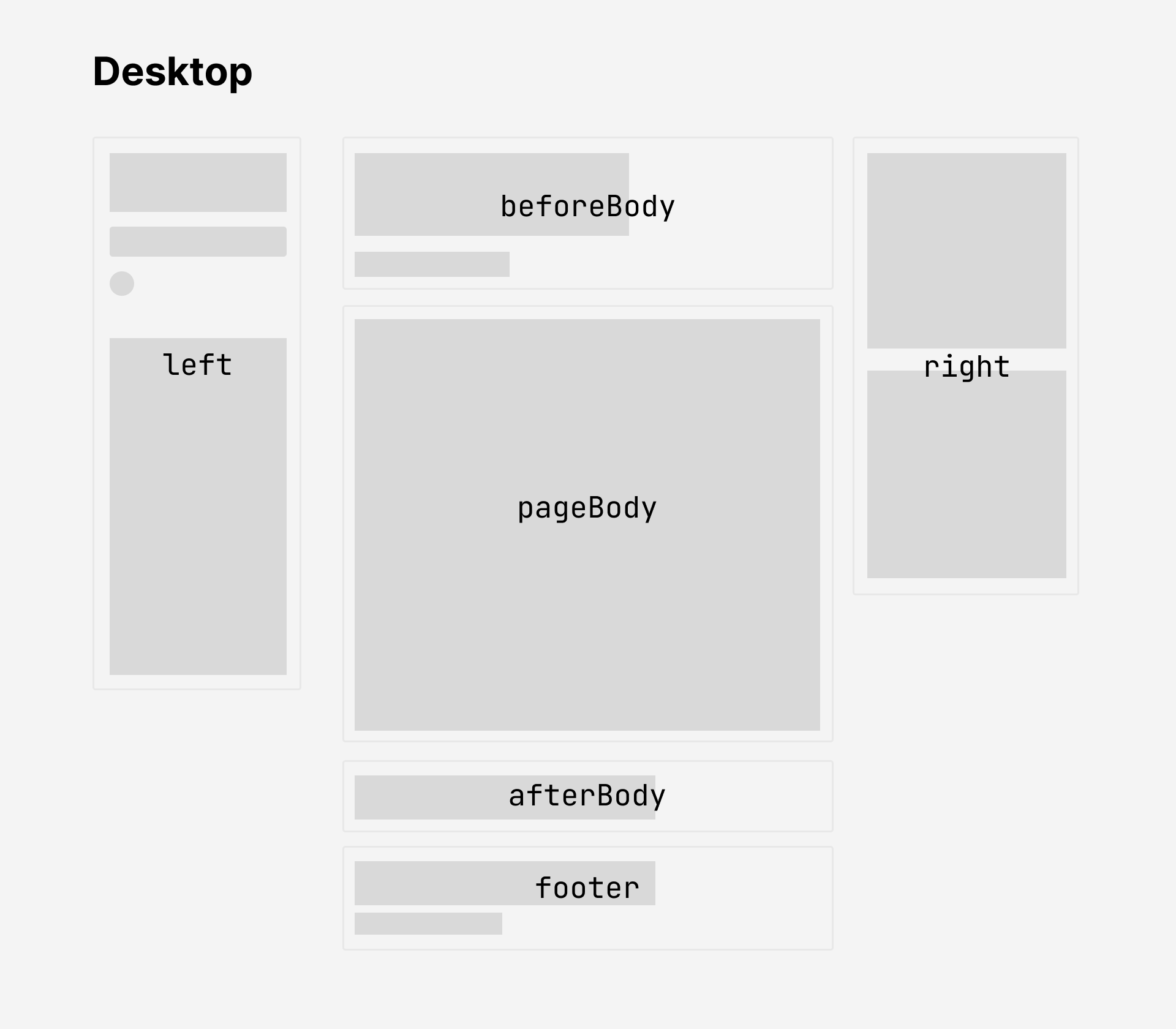 |
| Tablet (800px < width < 1200px) | 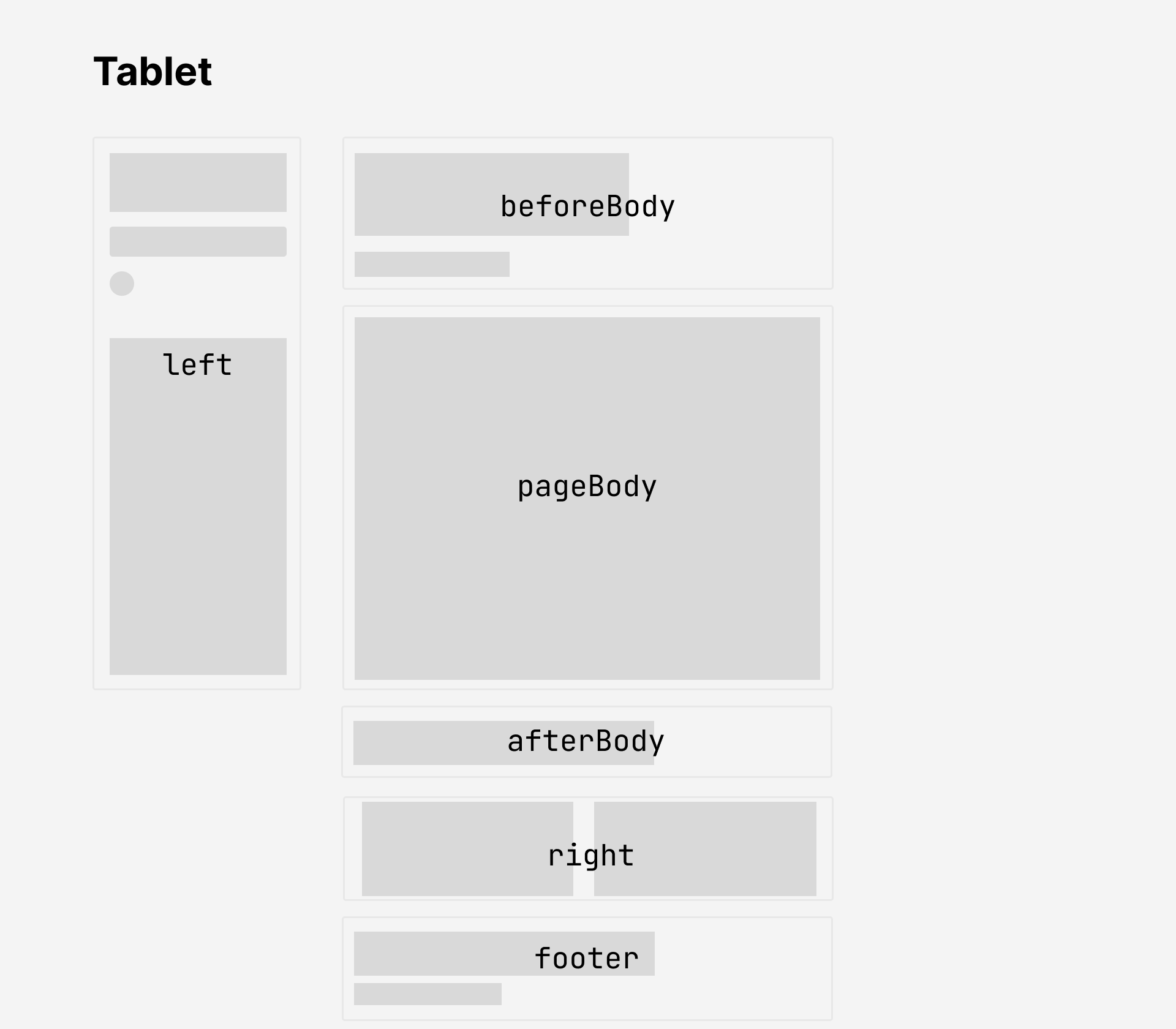 |
| Mobile (width < 800px) | 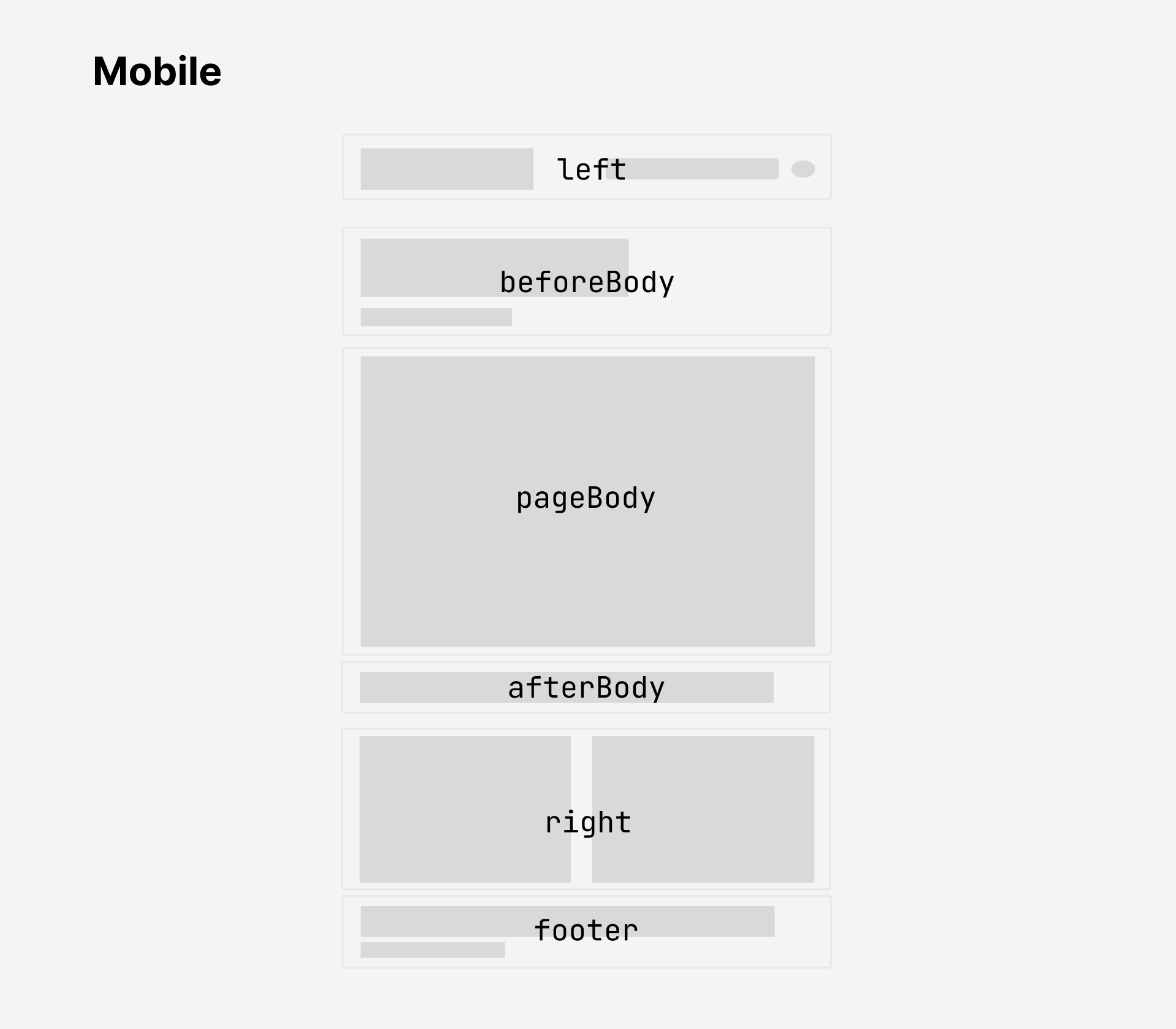 |
Note
diagram_omissions:
head: single component rendering the HTML<head>tag; invisible; owns document metadata such as tab title, scripts, stylesheader: horizontal component array beforebeforeBody; supports Quartz 3-style header bar with title, search, dark-mode toggle; empty by default
layout_configuration:
- source:
layoutsection inquartz.config.yaml - mechanics:
- plugins declare
layout.position - plugins declare
layout.priority - layout system orders components automatically
- plugins declare
- example:
plugins:
  - source: github:quartz-community/explorer
    enabled: true
    layout:
      position: left
      priority: 50
  - source: github:quartz-community/graph
    enabled: true
    layout:
      position: right
      priority: 10
  - source: github:quartz-community/search
    enabled: true
    layout:
      position: left
      priority: 20
  - source: github:quartz-community/backlinks
    enabled: true
    layout:
      position: right
      priority: 30
  - source: github:quartz-community/article-title
    enabled: true
    layout:
      position: beforeBody
      priority: 10
  - source: github:quartz-community/content-meta
    enabled: true
    layout:
      position: beforeBody
      priority: 20
  - source: github:quartz-community/tag-list
    enabled: true
    layout:
      position: beforeBody
      priority: 30
  - source: github:quartz-community/footer
    enabled: true
    options:
      links:
        GitHub: https://github.com/jackyzha0/quartz
        Discord Community: https://discord.gg/cRFFHYye7t

layout:
  groups:
    toolbar:
      direction: row
      gap: 0.5rem
  byPageType:
    content: {}
    folder:
      exclude:
        - reader-mode
      positions:
        right: []
    tag:
      exclude:
        - reader-mode
      positions:
        right: []
    "404":
      positions:
        beforeBody: []
        left: []
        right: []
Conditional Rendering
conditional_rendering:
- field:
layout.condition - purpose: control plugin visibility by page context
- example:
plugins:
  - source: github:quartz-community/breadcrumbs
    enabled: true
    layout:
      position: beforeBody
      priority: 5
      condition: not-index
available_conditions:
| Condition | Effect |
|---|---|
not-index | Hidden on the root index page, shown everywhere else |
has-tags | Only shown on pages that have tags in frontmatter |
details:
- conditional_rendering_and_display_options: layout-components
typescript_overrides:
- use_cases:
- custom component wrappers
- custom conditional logic
- advanced layout overrides
- file:
quartz.ts - example:
import { loadQuartzConfig, loadQuartzLayout } from "./quartz/plugins/loader/config-loader"

const config = await loadQuartzConfig()
export default config
export const layout = await loadQuartzLayout({
  defaults: {
    // override default layout for all page types
  },
  byPageType: {
    content: {
      // override layout for content pages only
    },
    folder: {
      // override layout for folder pages only
    },
  },
})
override_precedence:
byPageTypeentries overridedefaults
community_components:
- install:
npx quartz plugin add github:quartz-community/<name> - layout_utilities: layout-components
- examples:
FlexMobileOnlyDesktopOnly
custom_components:
- guide: creating components
Page Frames
page_frames:
- purpose: control page-level HTML shell
- scope: layout-slot arrangement for sidebars, header, content, footer
- benefit: page types can use structurally different layouts
built_in_frames:
| Frame | Description | Used by |
|---|---|---|
default | Three-column layout with left sidebar, center content (header, beforeBody, content, afterBody), right sidebar, and footer. This is the standard Quartz layout. | ContentPage, FolderPage, TagPage, BasesPage |
full-width | No sidebars. Single center column spanning the full width with header, content, afterBody, and footer. | — |
minimal | No sidebars, no header or beforeBody chrome. Only content and footer. | NotFoundPage (404) |
plugin_frames:
- plugins may register frames
- example:
canvas-pageprovides a"canvas"frame with fullscreen canvas and togglable sidebar
How frames are resolved
frame_resolution_order:
- 1: YAML config override:
layout.byPageType.<name>.templateinquartz.config.yaml - 2: plugin-registered frame: Frame Registry entries loaded from plugin
framesexports - 3: plugin declaration:
frameproperty in page-type plugin source - 4: fallback:
"default"
example_canvas_minimal_frame:
layout:
  byPageType:
    canvas:
      template: minimal
Custom frames
custom_frames:
- plugin_provided_frames:
- recommended_for: reusable frames
- declaration:
package.json - export_path:
./frames - registration: automatic Frame Registry registration when installed
- guide: the plugin guide
- core_frames:
- recommended_for: project-specific frames
- path:
quartz/components/frames/ - requirement: implement
PageFrame - registration:
quartz/components/frames/index.ts - interface_reference: architecture overview
frame_css_targeting:
- runtime_attribute:
data-frameon.page - selector_pattern:
[data-frame="name"] - reason: prevent cross-frame CSS conflicts
- example:
.page[data-frame="my-frame"] > #quartz-body {
  /* custom grid layout */
}
Layout breakpoints
layout_breakpoints:
- source:
variables.scss - modes:
mobile: screen width belowmobiletablet: screen width betweenmobileanddesktopdesktop: screen width abovedesktop
$breakpoints: (
  mobile: 800px,
  desktop: 1200px,
);
Style
style:
- common_changes: general configuration
- colour scheme
- font
- advanced_changes:
- write project styles
- engine: Sass
- base_stylesheet:
quartz/styles/base.scss - custom_stylesheet:
quartz/styles/custom.scss
Note
component_styles:
- some components ship styles
- community plugins bundle styles
- component-specific customization requires checking the component definition for style sources